Luxe Noir: Quiet Luxury Commerce
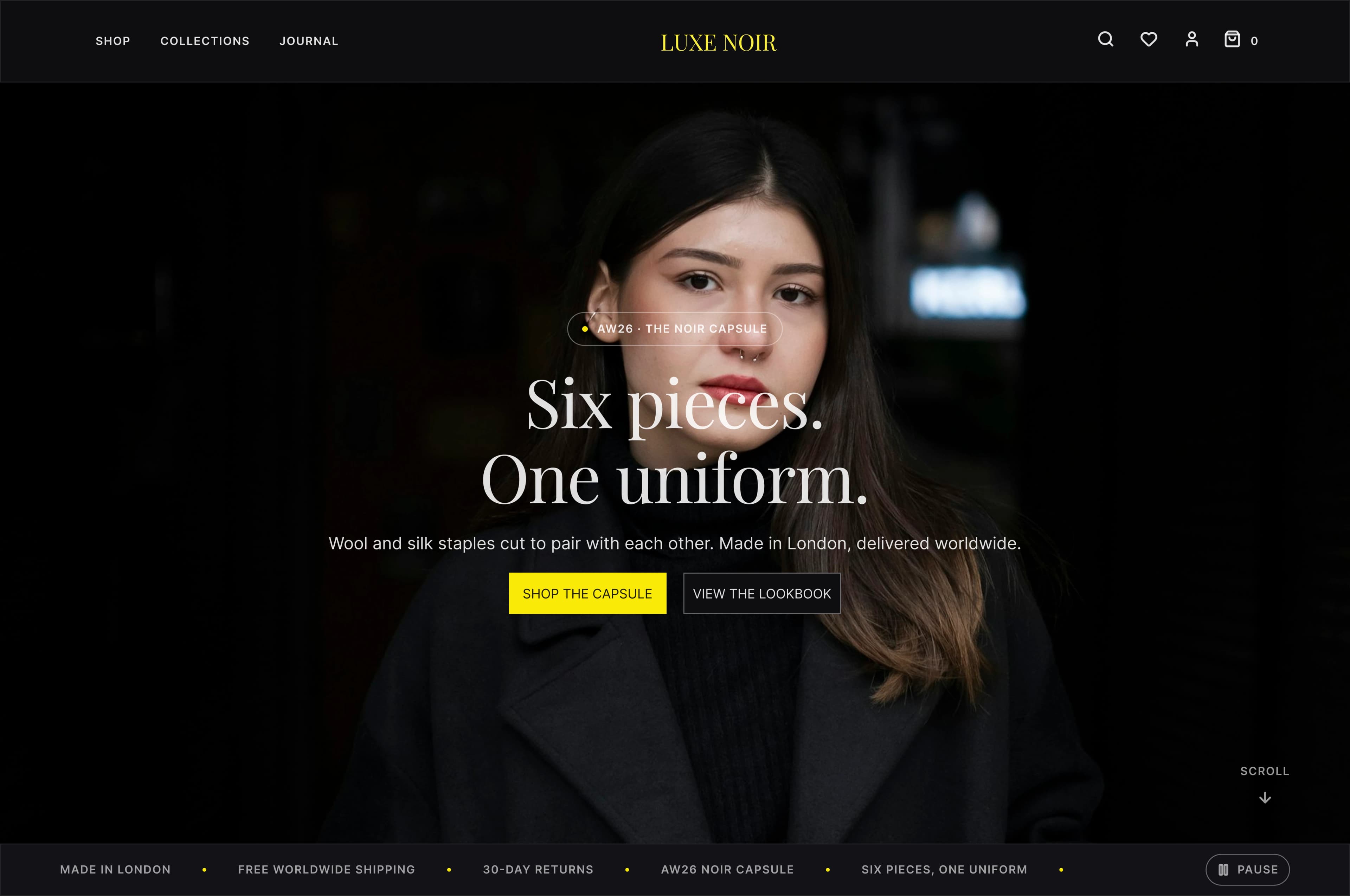
A responsive commerce system for a fictional London capsule wardrobe: editorial enough to feel distinctive, structured enough to make every decision clear. 67 routes designed as one coherent system, from landing page to ownership. A design concept, not a built store. Designed by me with Claude Code and Codex.
- Role
- UI · UX Designer, with Claude Code & Codex
- Timeline
- Concept project, 2026
- Platforms
- Web · Desktop 1440px · Web · Mobile 390px
- Figma
- Claude Code
- Codex
- Routes · desktop + mobile
- 67
- Design tokens
- 321
Overview
The project
Luxe Noir is a fictional London label built around a permanent capsule wardrobe, and the brief was narrower than it sounds: build trust without adding noise. Luxury retail tends to look beautiful right up to the moment somebody tries to buy, at which point the editorial mood hands over to a generic checkout, so the work was never about adding more visual luxury, it was about making confidence feel luxurious. Three principles carried every screen: remove competing choices until the product story leads, reveal the mill and the fibre and the fabric weight before anyone has to ask, and keep delivery, returns and repair beside the purchase rather than buried under it. The visual language is deliberately small (ink, paper, charcoal and one electric accent, bound as 321 variables so a change lands everywhere at once), and repetition is what turns that restraint into recognition across 67 routes. Mobile was designed as its own rhythm rather than a narrower desktop, changing information order and action placement while keeping the same voice. The system was designed to the point where it could be handed to a build: 16 UX state screens, a cart that holds its contents across the journey, filtering, search, a checkout with no payment field anywhere, and a journal, all specified as screens. It is a design concept: none of it was built. Designed by me in collaboration with Claude Code and Codex.
How it was made
Design process
Positioning
Audit of luxury retail journeys; a capsule-wardrobe brand defined around restraint rather than volume
Architecture
67 routes grouped into four branches (discover, evaluate, purchase, own) sharing one persistent page spine
Design system
Ink, paper, charcoal and a single electric accent, bound as 321 variables across colour, type and spacing
Hi-fi + components
134 production frames at two breakpoints, driven by 11 component families and 1,250 instances
UX states
16 state screens (empty, loading, error and confirmation) so the system covers the journey, not just the happy path
What I learned
Research insights
Beauty stops at the buy button
Luxury sites hold their editorial mood right up to the moment someone tries to purchase, then hand over to a generic checkout. The mood had to survive the whole journey, so the same grammar carries the cart and the confirmation.
Premium claims need evidence
"Quality" means nothing when fibre, mill and fabric weight are hidden. Every product names its cloth and its mill above the fold, so the price has something to stand on before the ask.
The considered buyer returns
This shopper reads, compares and comes back days later. Saving a piece never interrupts browsing, and the cart survives navigation; the journey assumes a second visit rather than a single session.
Mobile is a different rhythm
A scaled-down desktop grid makes comparison and checkout harder. Mobile changes information order, gallery depth and action placement while keeping the same voice.
Why it looks like this
Key design decisions
Remove, reveal, reassure
One principle behind every screen: cut competing choices, name the material facts, and keep delivery and returns beside the action
Trust sits next to the decision
Mill, fibre, fit, availability, delivery and returns ladder up to the primary action rather than hiding in a tab below it
One accent, doing one job
Playfair carries the voice, Inter carries the information, and the yellow signal marks action and progress, never decoration
Add to cart is gated on size
The button stays inert until a size exists, so nobody orders the wrong size by accident, and the notice clears as the action lights
One card anatomy, everywhere
11 component families and 1,250 instances mean image, badge, name, price and cloth repeat identically across all 67 routes
Motion with a job to do
One easing curve, 200–700ms, nothing that moves for its own sake, and every transition removed under reduced-motion
The screens
Gallery
What I used
Tools
Figma
UI design, component library & 134 production frames
Figma Variables
321 tokens: colour, type, spacing and radius
Claude Code
Design collaboration & assembling the Figma file
Codex
Design collaboration
What came out of it
Results
67
Routes designed
134
Production frames
321
Design tokens
11
Component families
1,250
Instances in use
16
UX state screens